Slider
Introduction
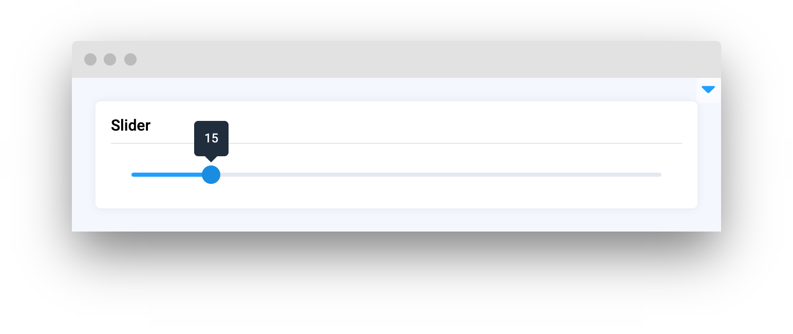
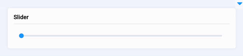
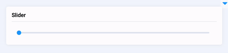
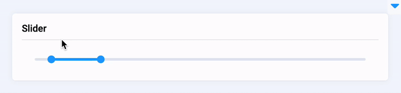
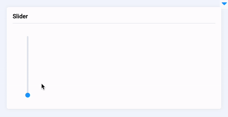
Slider is a widget in Supervisely that allows users to input numerical values within a specific range. The widget is commonly used to set parameters such as batch size in machine learning models. Users can adjust the slider handle to select the desired value, and the corresponding numerical value is displayed. Slider widget also provides users with the ability to customize the slider range, height in vertical mode and step size between values, allowing for more precise and flexible inputs.
Function signature
Parameters
| Parameters | Type | Description |
|---|---|---|
|
|
|
|
| Minimum value |
|
| Maximum value |
|
| Step size |
|
| Whether to display an input box, works when |
|
| Whether to display control buttons when |
|
| Whether to display breakpoints |
|
| Whether to display tooltip value |
|
| Whether to select a range |
|
| Vertical mode |
|
|
|
|
| Specifies an inline style for an element |
|
| ID of the widget |
value
Determine Slider start value.
type: Union[int, List[int]]
default value: 0
min
Determine Slider minimum value.
type: int
default value: 0
max
Determine Slider maximum value.
type: int
default value: 100
step
Determine step size.
type: int
default value: 1
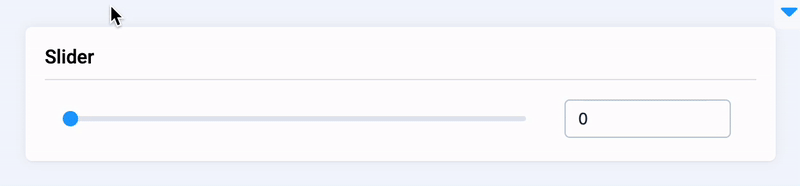
show_input
Whether to display an input box, works when range is false.
type: bool
default value: false
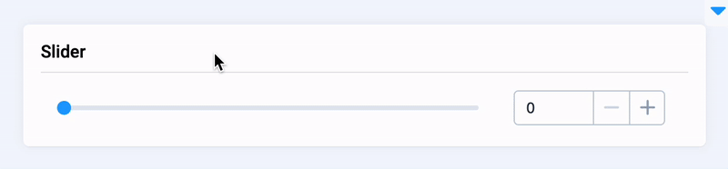
show_input_controls
Whether to display control buttons when show-input is true.
type: bool
default value: false
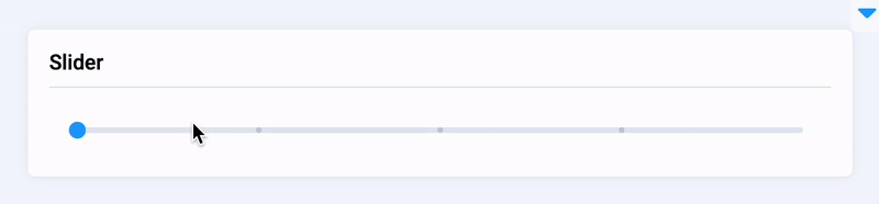
show_stops
Whether to display breakpoints.
type: bool
default value: false
show_tooltip
Whether to display tooltip value.
type: bool
default value: true
range
Determine whether to select a range, equires value to be List[int, int].
type: bool
default value: true
vertical
Determine vertical mode.
type: bool
default value: false
height
Determine Slider height, required in vertical mode.
type: int
default value: None
style
Specifies an inline style for an element.
type: str
default value: ""
widget_id
ID of the widget.
type: str
default value: None
Methods and attributes
| Attributes and Methods | Description |
|---|---|
| Set |
| Return |
| Set |
| Return |
| Set |
| Return |
| Set |
| Return |
| Return |
| Set |
| Set |
| Return |
| Set |
| Set |
| Return |
| Set |
| ESet |
| Return |
| Set |
| Set |
| Decorator function is handled when value is changed |
Mini App Example
You can find this example in our Github repository:
ui-widgets-demos/controls/005_slider/src/main.py
Import libraries
Init API client
First, we load environment variables with credentials and init API for communicating with Supervisely Instance:
Create Text widget we will use in UI for demo Slider widget
Text widget we will use in UI for demo Slider widgetInitialize Slider widget
Slider widgetCreate app layout
Prepare a layout for app using Card widget with the content parameter and place widget that we've just created in the Container widget.
Create app using layout
Create an app object with layout parameter.
Add functions to control widget from code
Last updated