Card
Introduction
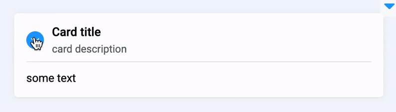
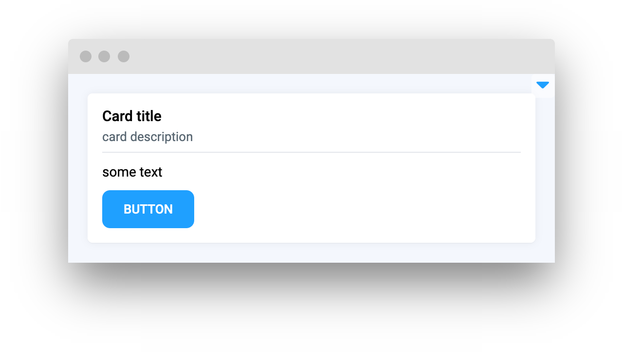
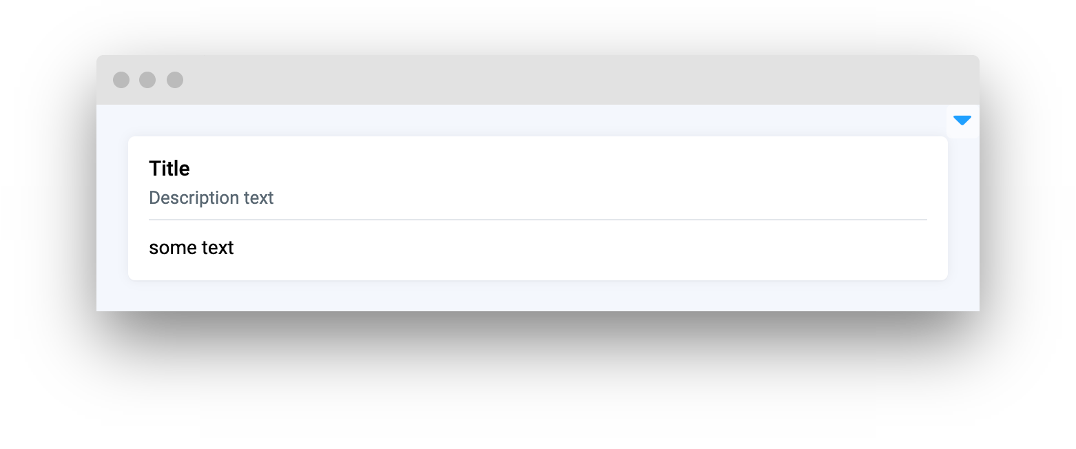
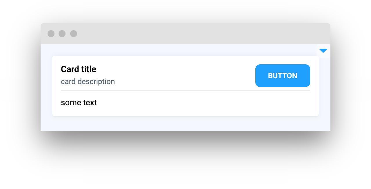
Card widget in Supervisely is a simple widget that can be used to display information or content in a compact format. It can be controlled by setting loading/lock properties and can be collapsed to save space. It provides a straightforward and easy-to-use solution for displaying information clearly and concisely.
Function signature
Parameters
| Parameters | Type | Description |
|---|---|---|
|
| Card widget title |
|
| Description text for card widget |
|
| Enable |
|
| Widget to place in Card widget |
|
| Widget to place in top right corner of Card widget |
|
| Message to display when card will be locked |
|
| Widget ID |
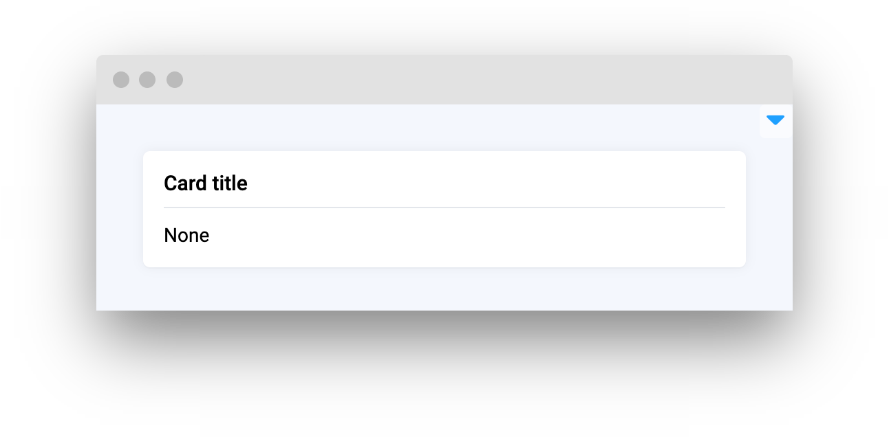
title
Card widget title
type: str
default None
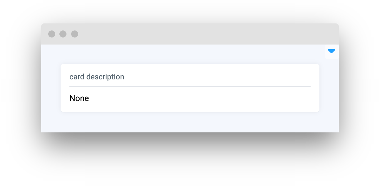
description
Description text for card widget
type: str
default None
collapsable
Enable collapsable property to allow minimize card widget
type: bool
default False
content
Widget to place in Card widget
type: Widget
default None
content_top_right
Widget to place in top right corner of Card widget
type: Widget
default None
lock_message
Message to display when card will be locked
type: str
default "Card content is locked"
widget_id
Widget ID
type: str
default None
Methods and attributes
| Attributes and Methods | Description |
|---|---|
| Get or set |
| Minimize card widget. |
| Expand card widget. |
| Lock card widget and show message. |
| Unlock card widget and hide lock message. |
| Check if card widget is locked. |
Mini App Example
You can find this example in our Github repository:
ui-widgets-demos/layouts and containers/001_card/src/main.py
Import libraries
Init API client
First, we load environment variables with credentials and init API for communicating with Supervisely Instance:
Prepare widgets we will use in Card widget
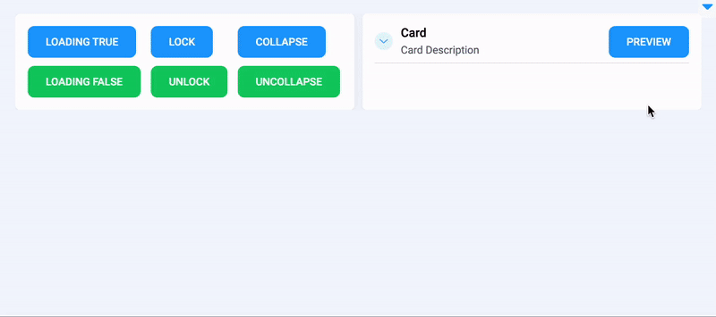
Card widgetButtons to enable loading property, lock and collapse Card widget:
Buttons to unlock, uncollapse and disable loading property of Card widget:
Use Container widget to join Button widgets in groups.
Prepare widgets to display some image.
Initialize Card widgets
Card widgetsInitialize one Card widget for buttons
Initialize second Card widget for previewing images.
Create app layout
Prepare a layout for app using Card widget with the content parameter.
Create app using layout
Create an app object with layout parameter.
Add functions to control widgets from python code
Last updated